This space started as a completely blank slate…or shall I say, “beige slate” with REALLY bad carpet. It now is a unique, eclectic, whimsical, and colorful space that my teenage daughter is chomping at the bit to move down into.
The bedroom, toy room, striped chairs, hallway, and workout space will be revealed in the near future, but for now I can’t wait to show you the main section of the basement…The sofa, kitchenette, and eating areas.
SOFA AREA
Before Basement Makeover
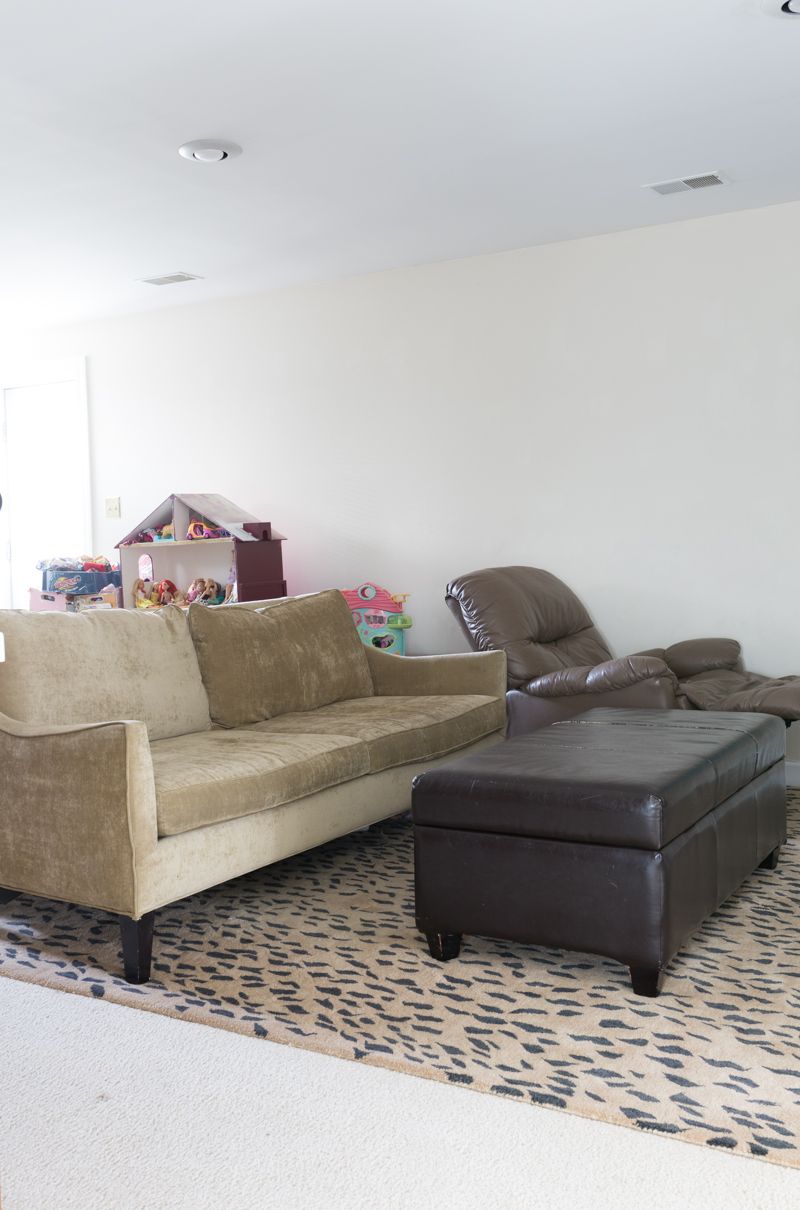
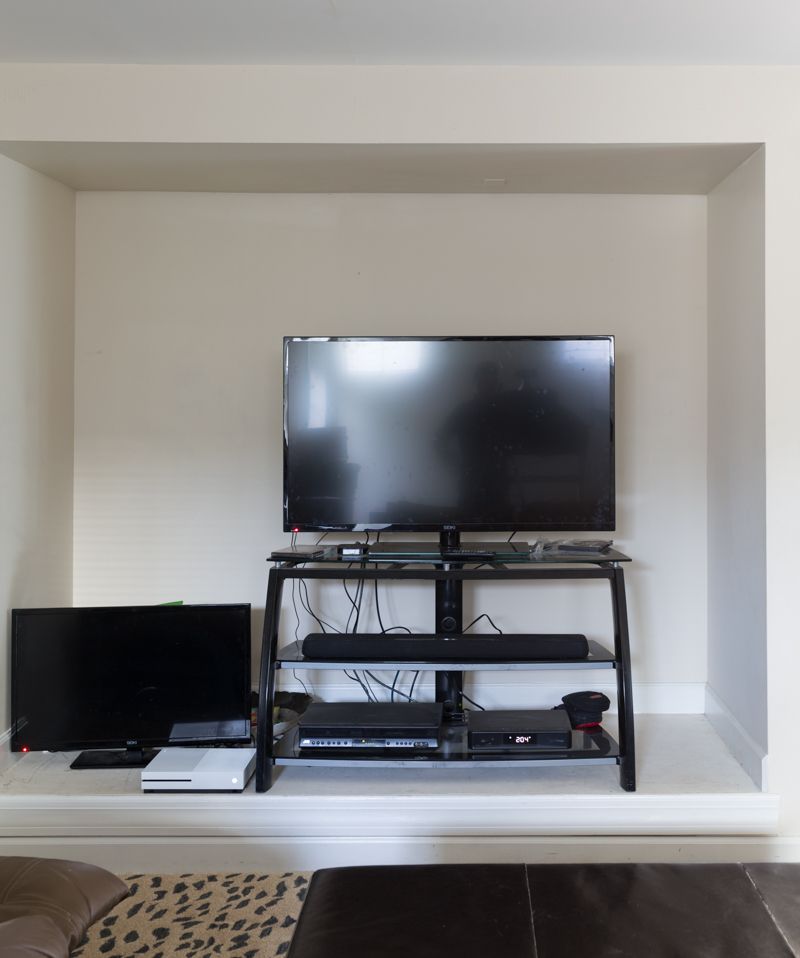
AFTER BASEMENT MAKEOVER
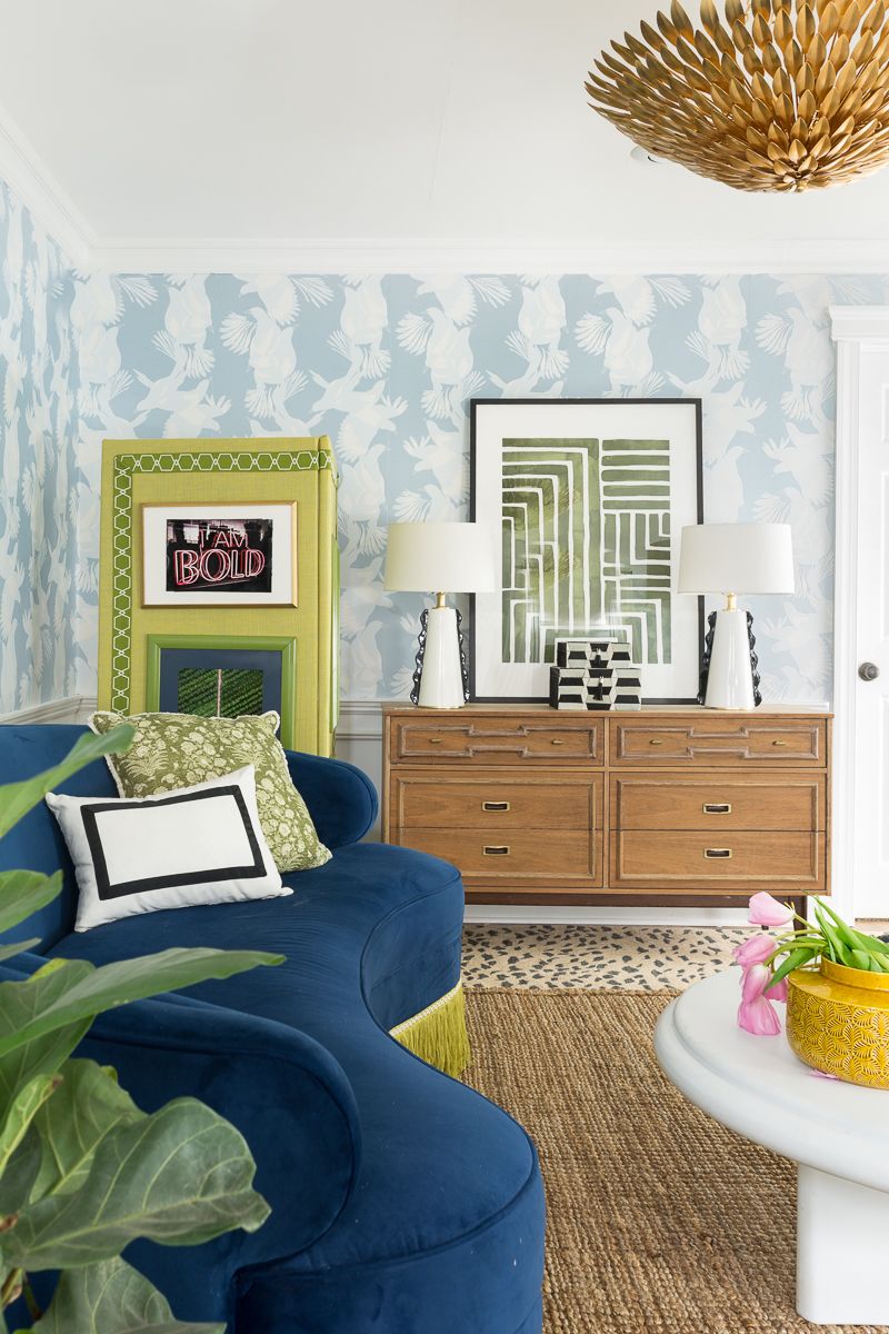
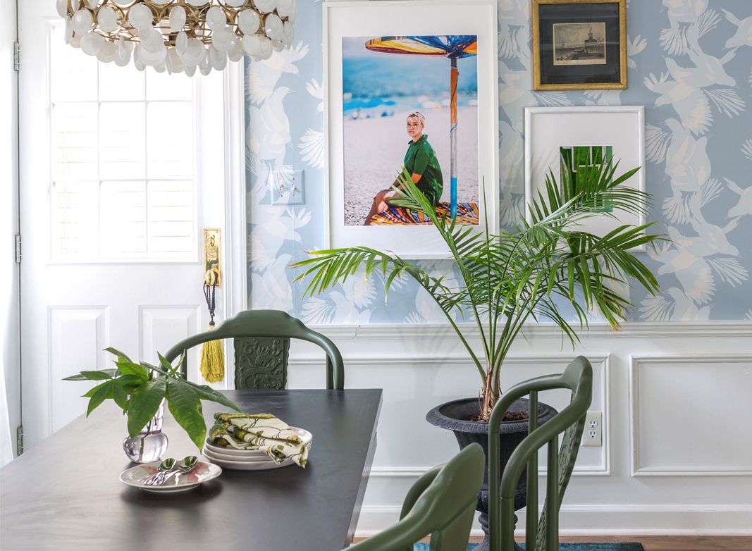
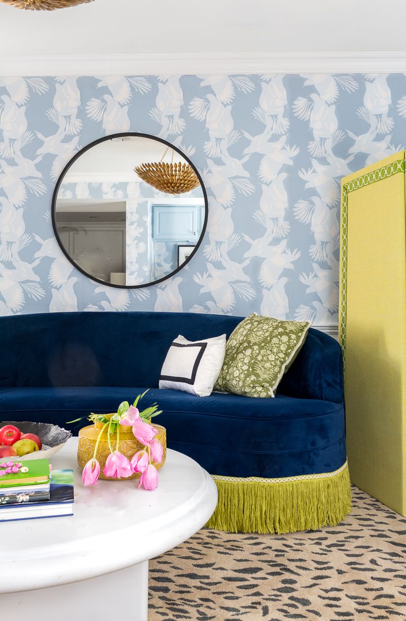
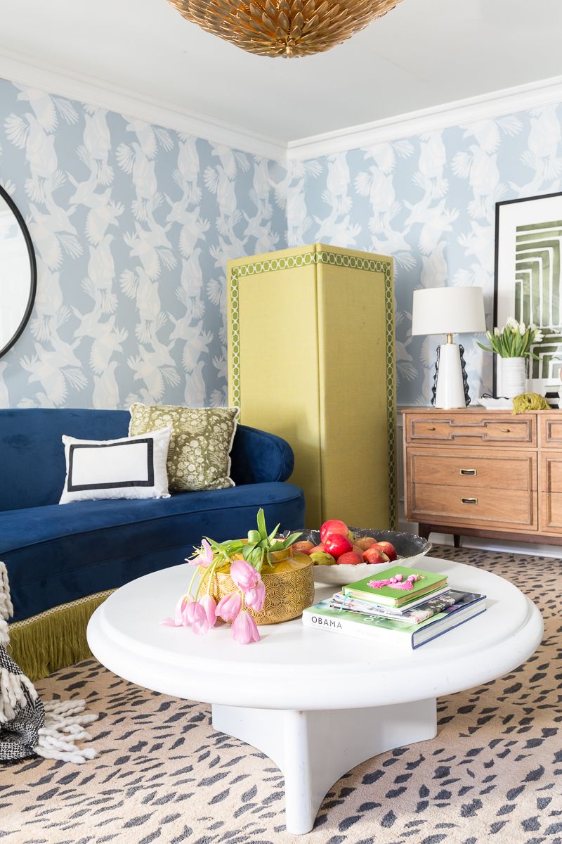
Can I get a “slow clap” for that formerly “top-secret” Milton and King Magpie Wallpaper? It is part of their new Australia collection, and I knew the moment that I saw it that it was made for our home. It comes in several other colorways, including a really fun black and white version. I like that the graphic element because it feels youthful enough for a teenager pad, but sophisticated enough to match the rest of our home.
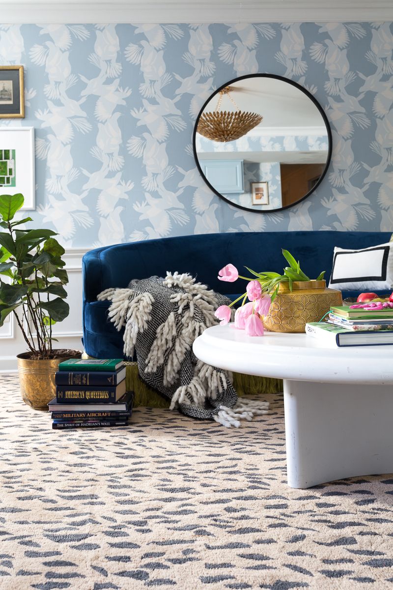
I love a lot of the 17 wallpaper brands that Milton and King carries, but there is just something about Kingdom Home that always speak to me. When I found out that they were coming out with something new, I had a pretty good hunch that I would love it….I was right.
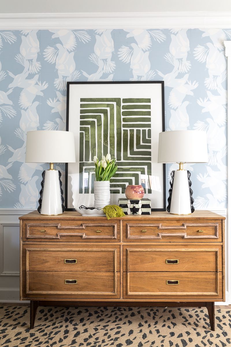
For planning purposes, it took 5 rolls to do my basement. I used Metrie New Traditional line moulding, or it would have taken a lot more. Normally I wouldn’t recommend breaking up a short wall (these are less than 8 feet) with chair rail, but the vertical lines of the wallpaper draw your eye up. This, and the light color of the wallpaper made it ok. The ceiling actually feels taller than before…and a heck of a lot cooler! Woot Woot!
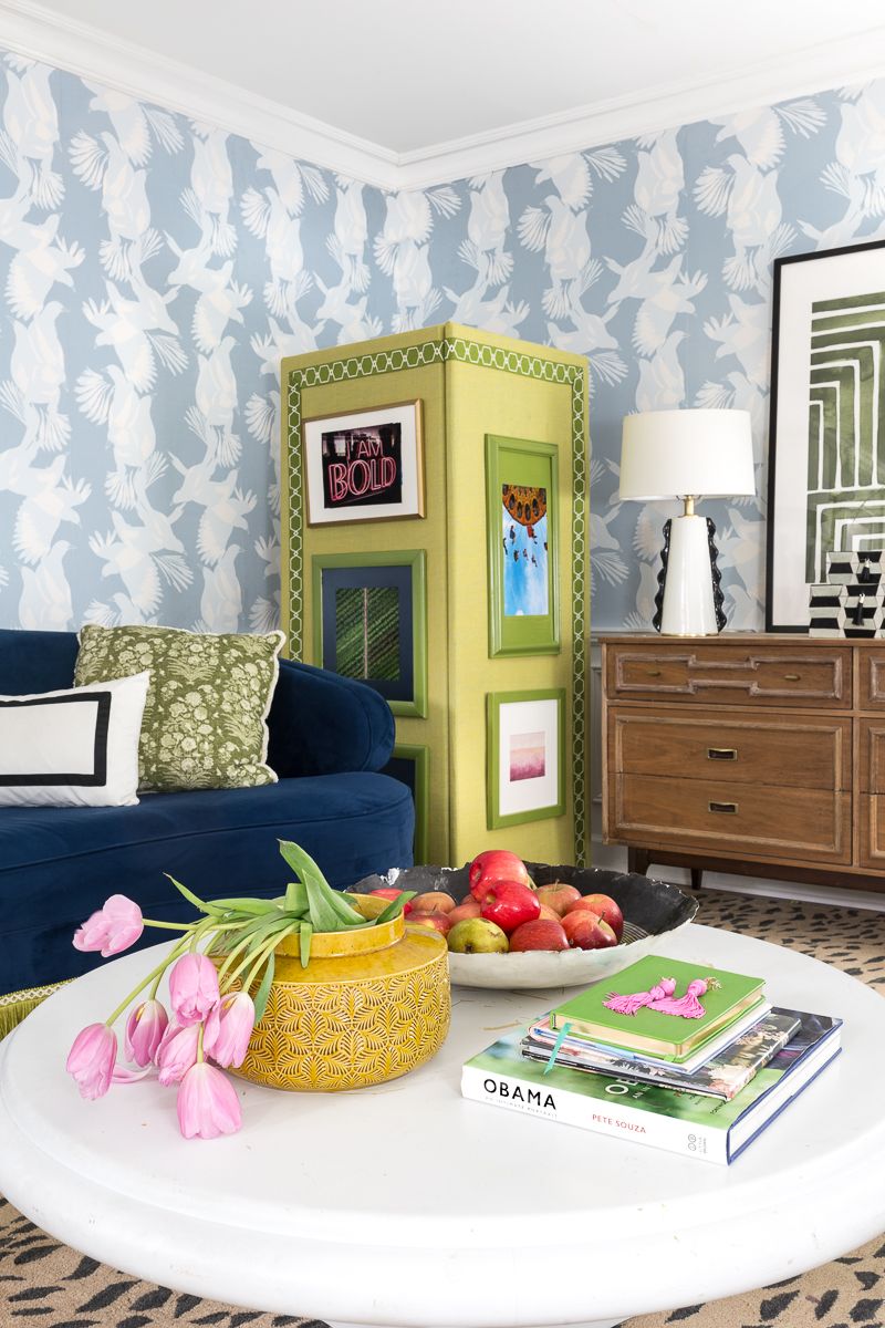
Aside from the new black and white lamps and pretty new chandelier, the rest of this space is comprised of items that I have been shoving away in our basement for the last year and a half. I had been hoarding this eclectic stash because I saw potential in each of these pieces.
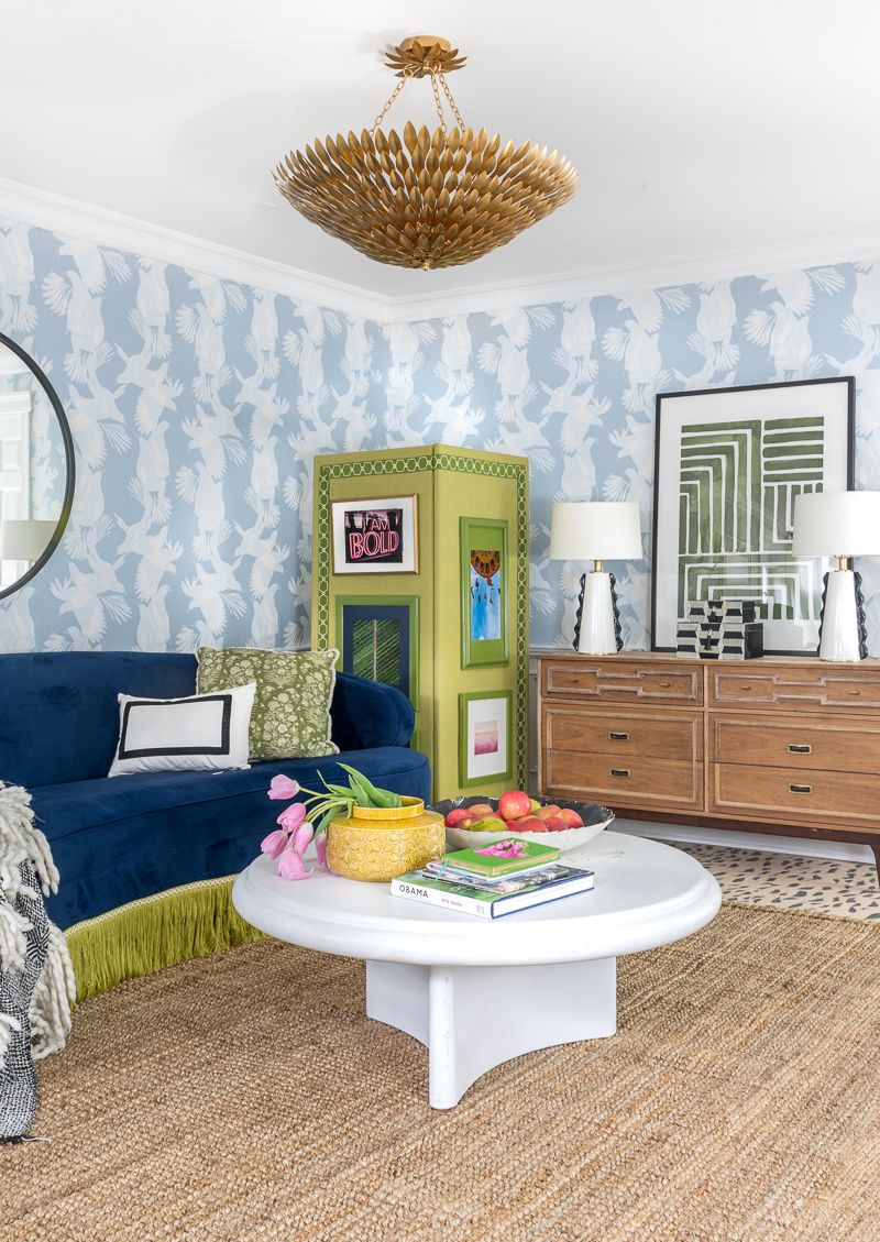
Perhaps this has been my theory for a while. When I hold onto what I love, regardless of style or era, I end up with a unique and soulful space. Is it right to pair an Art Deco inspired sofa with fringe, Karl Springer style Post-Modern Contemporary coffee table, glam leopard rug, Mid Century dresser, and a Chinese screen that I recovered with left over fabric and pretty trim. Probably not, but I gotta say…I don’t hate it. Especially for a teenager’s hang out.
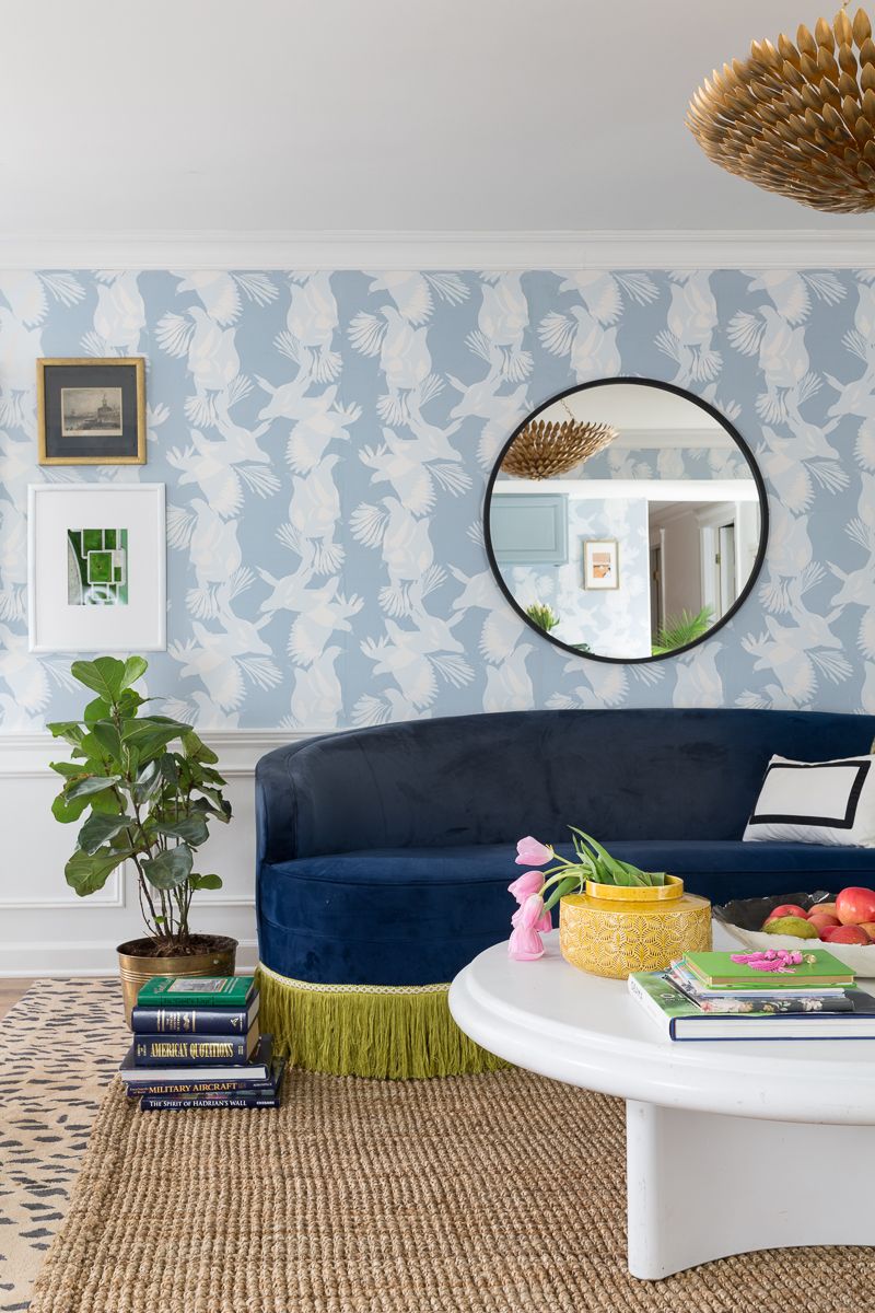
Maybe you prefer a more traditional look? Here is the same space with no jute rug and no frames on the screen. I like this vibe too.
KITCHENETTE AREA
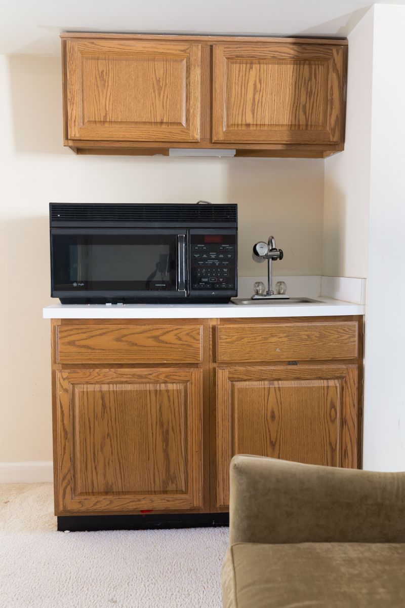
BEFORE MAKEOVER
AFTER BASEMENT MAKEOVER
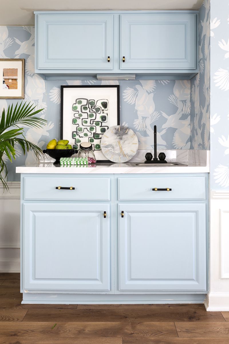
What do you think? A little more fun, right?
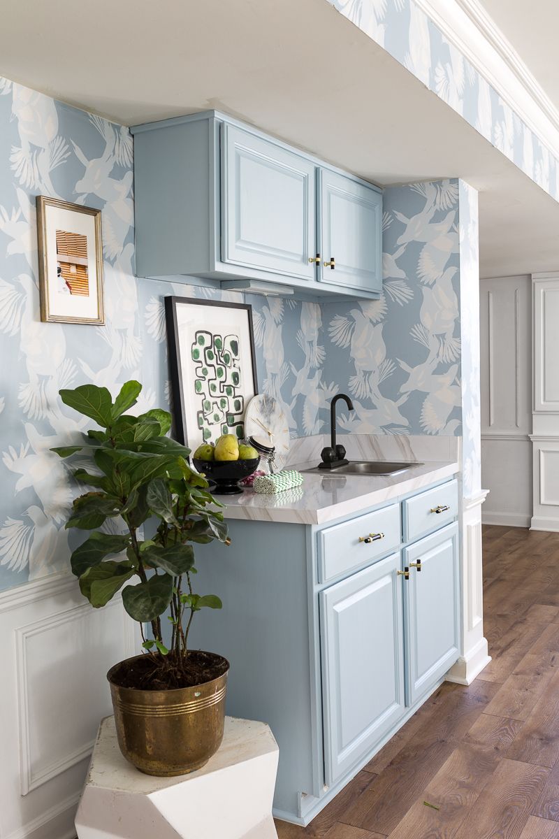
This vignette was 100% budget friendly…It just was not a priority to replace the cabinet and install a new sink, faucet, and marble. We love the teenager, but we never really use this sink…like ever. The teenager has grand visions of a mini fridge and microwave to make herself fresh fruit and oatmeal breakfasts. I have a feeling these ideas will die as soon as she realizes she will have to wash her dishes by hand down here. LOL
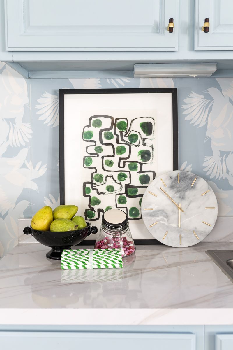
I deglossed the cabinets with Velvet Finishes Ready Spray and a light sand. I color-matched paint to the wallpaper at the local hardware store, and then finished the cabinets with Velvet Finishes Protect. So far so good.
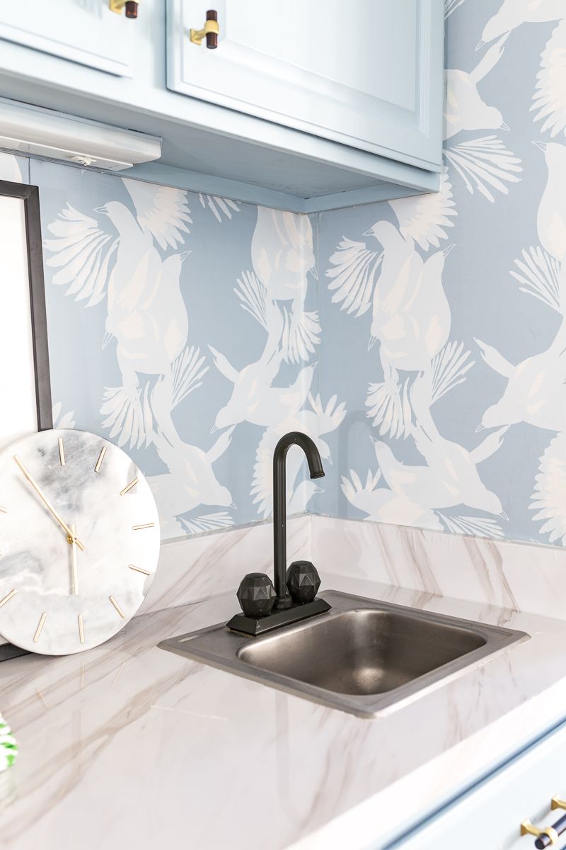
That is the original faucet, but with a coat of the new spray paint that I have been obsessed with this month. I am still waiting a little bit before deciding if promoting painting 1989 crystal knob faucets with spray paint is a good idea…but did I mention we never use this sink? Also, I actually like the architectural detail of the knobs in matte black.
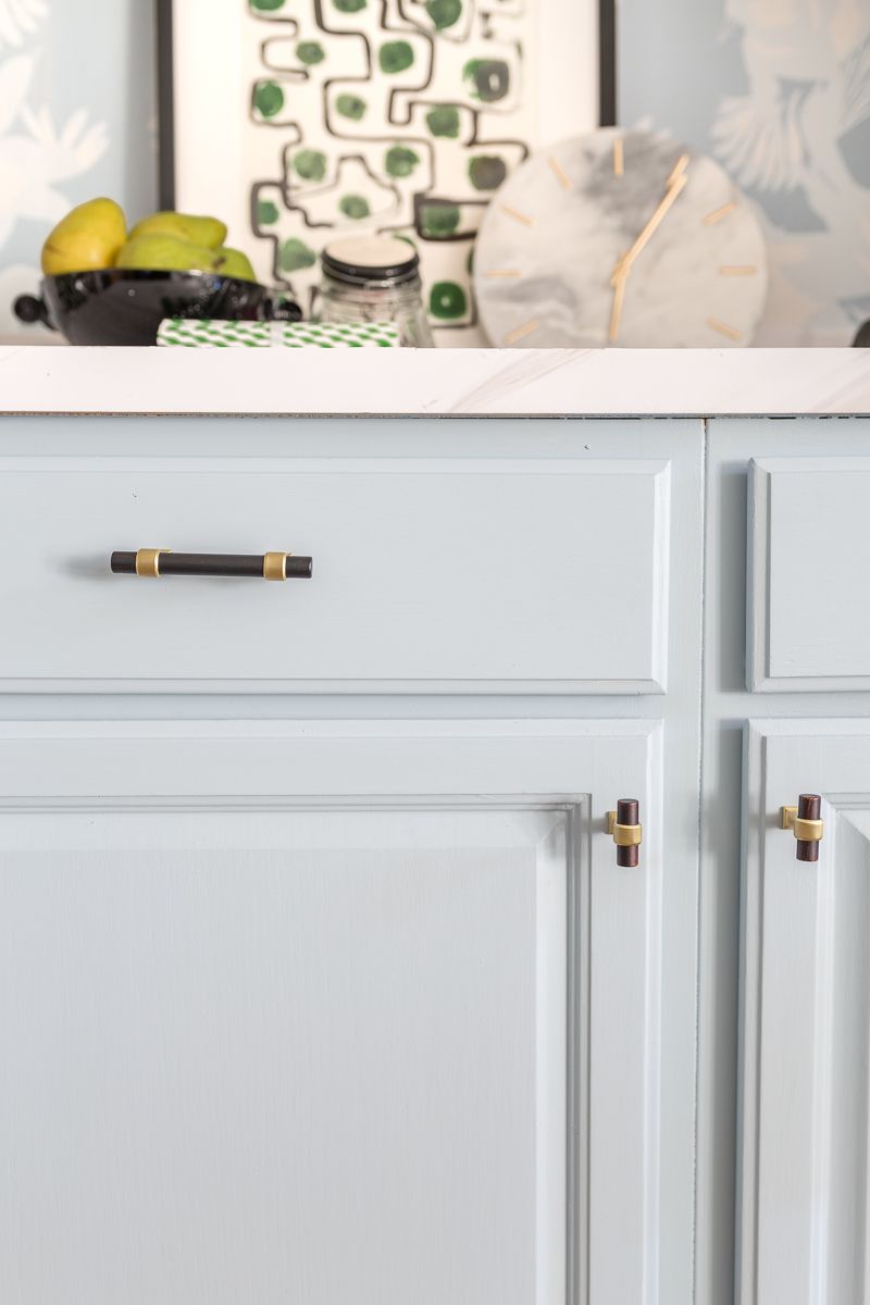
Continuing with the budget friendly theme, I picked out affordable, yet stylinsh knobs and pulls from Liberty Hardware.
EATING AREA
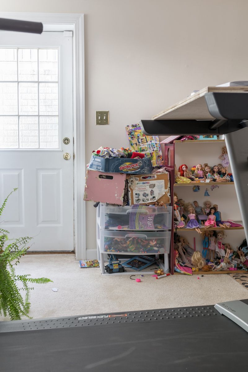
Before Basement Makeover
Last but not least, we drywalled a closet into a play room for all of the toys. We also moved the treadmill to another section of the basement. That left space for a small eating area here.
AFTER BASEMENT MAKEOVER
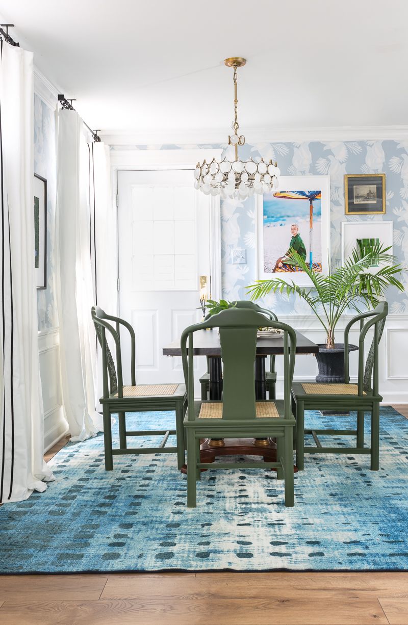
This might just be my favorite of the three new zones. What do you think?
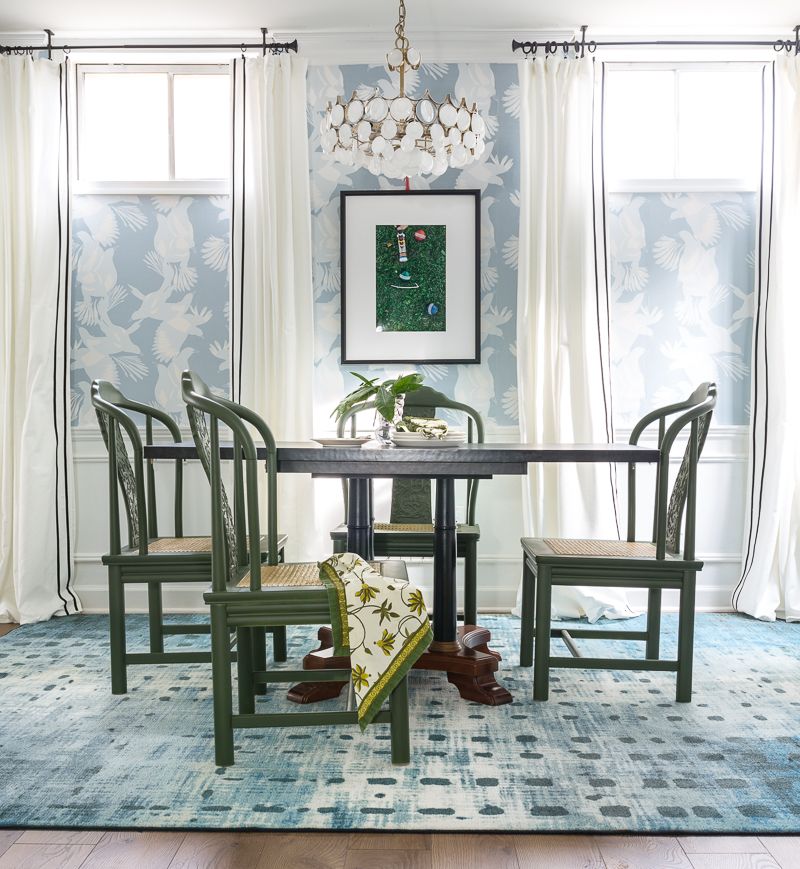
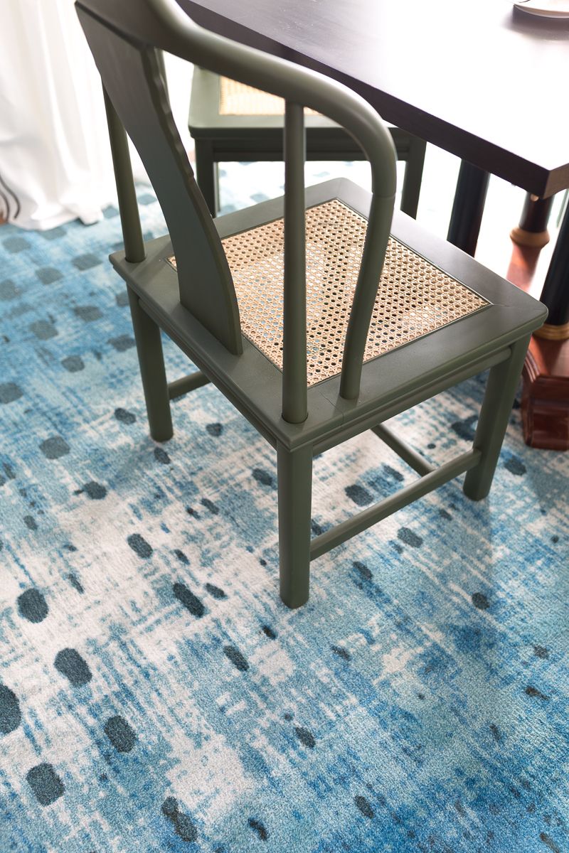
These chairs were a recent Marketplace purchase that I painted in spray paint. I’m so glad that I opted to go green!
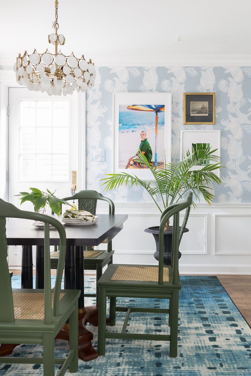
The chandelier was an old vintage one that I bought at an auction in England. Until two days ago it was a crystal chandelier, but that was too fancy for a teenager ‘s basement. I spray painted one side of each of the crystals and I really like the effect.
The curtains are from Ikea and I used iron on adhesive tape to form the double stripe. You know I love a good black and white stripe.
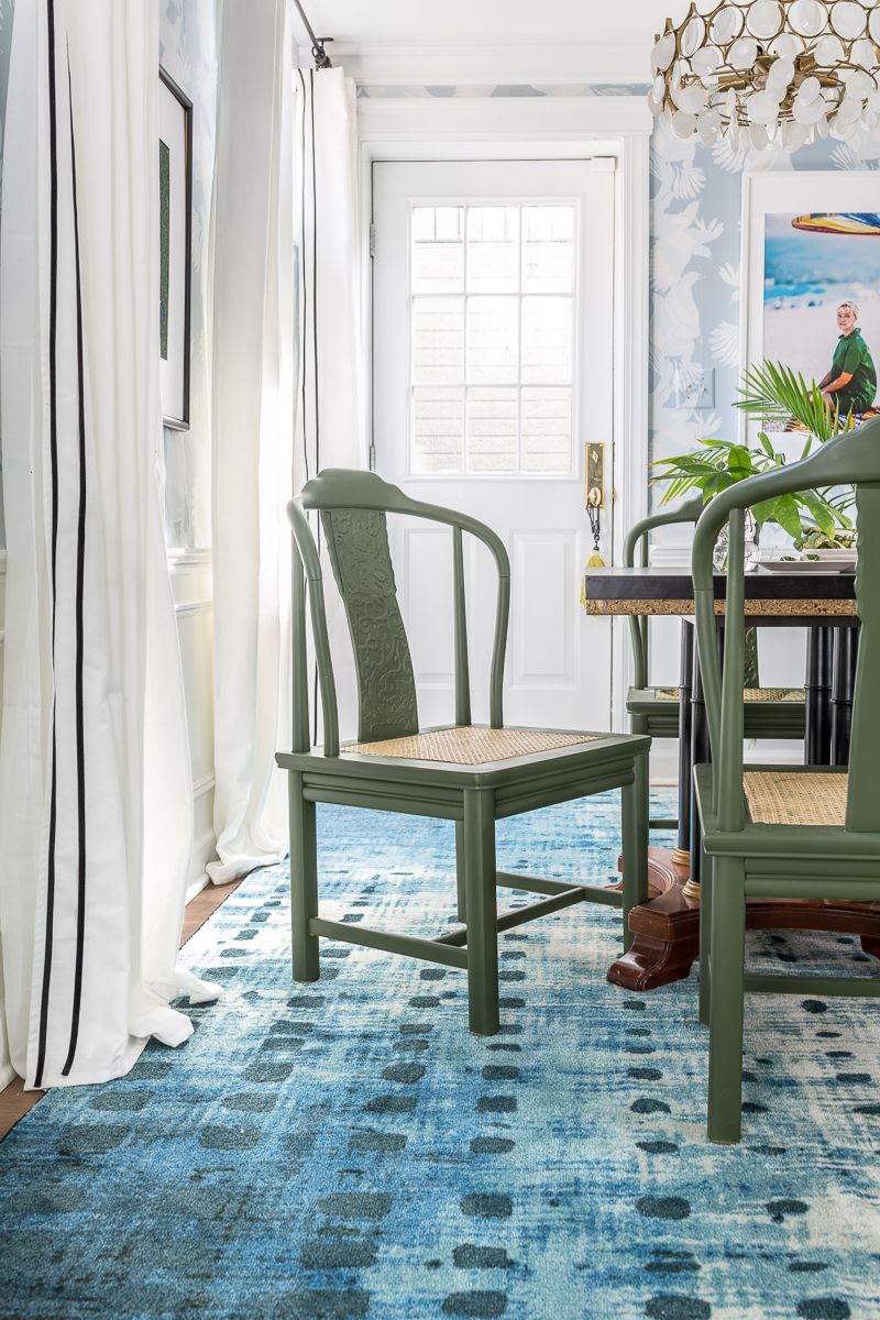
The pretty Mohawk Cassiopeia rug not only looks great up in my living room, it a looks pretty fab down here too. Eventually this rug will move to the workout area to tie the two rooms together with blue.
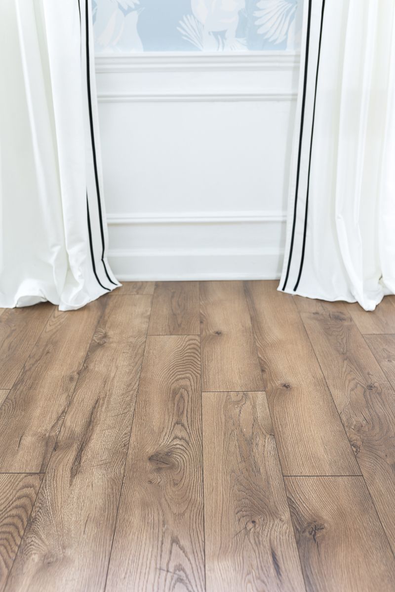
I think it is fair to say that my favorite part about the entire basement makeover was the week we ripped out the old stained carpet and replaced it with this beautiful Select Surfaces laminate flooring in Heritage Oak. It no longer feels like a dingy old basement, but rather a finished space. The best part is that this beautiful floor is 24 hour spill resistant. So if my kids spill water from that little sink, all is well. That makes me so happy!
For the full blog and for links to more details on each aspect of this room, visit Jewel Marlowe’s blog.
